Shopping funnel optimization tips
For ecommerce stores, the holiday season is the best time of the year for a different reason — it’s the perfect time to reap the rewards of shopping funnel optimization. With Christmas only a few weeks away, this article will provide you with a few easy-to-implement last-minute adjustments to maximize conversions and revenues.
The real battle begins when people have already put items into their shopping carts. It’s when you have the biggest opportunity to turn window-shopping into done deals. So at this point, it’s crucial to ensure that the checkout funnel on your website is at its optimal level. Why? Because when people reach the checkout page, usually, they have already made up their minds to buy something and they are most likely to convert.
But let’s face it, not everyone who’s heard about your brand and visited your site will magically turn into loyal customers. According to studies, as many as 75% of users abandon the shopping cart stage for many reasons. This is why optimization at every stage of the funnel is critical to improve the number of people you drive towards conversion. Optimizing your shopping funnel puts the focus on your customers, which, in turn, increases conversions and improves customer experience — the winning combination.
What is a shopping funnel?
The shopping or checkout funnel is a visual metaphor for the path taken by a potential customer as they move towards becoming a customer. It’s a process that helps you to visualize and understand the customer purchase flow, and guide the potential customers towards conversion, from the time they land on your site to the time they convert into actual customers.
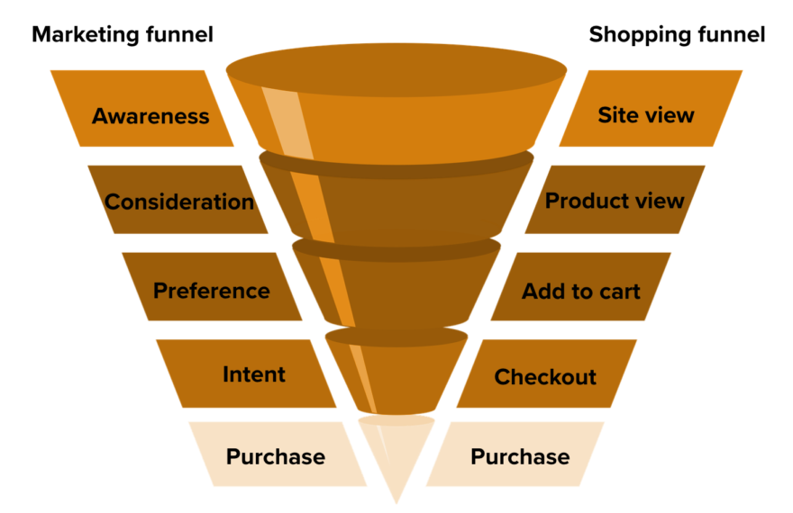
The entire customer journey could take place in a matter of minutes, or hours, or even days, as a customer visits the site, adds items to their cart, and completes their purchase. The funnel shows the number of pages that customers visit from the landing page to the ‘thank you for your purchase’ page. Because the shopping funnel is at the baseline of the marketing funnel and the start of the checkout process, all the marketing efforts have already paid off at this stage.
Understanding the marketing funnel and how it is related to the shopping funnel
Let’s go through the marketing funnel to truly understand how customers move down through the whole journey – from initial contact to final purchase – as they learn more about your product and express intent to purchase it.
A marketing funnel helps you map the customer journey from the initial stages when people become aware of your business up to the time they’re ready to make a purchase. Through the funnel, you can easily identify what you need to do at each stage to make sure that the customer moves towards making a buying decision.
The objective is to improve the conversion rate at each stage of the funnel so that more customers make it through the full funnel. So in a sense, the marketing funnel attracts shoppers to the funnel and pours people in so they can get to the next funnel – the shopping funnel. Once people have reached the last stage of the marketing funnel, you need to pull them through the shopping funnel and guide them to the next desired action. People should be certain about the next steps to take and should easily see the options available.
For example, a typical marketing funnel for an ecommerce site starts with attracting website visitors and ends with the decision to purchase, while the shopping funnel starts with landing on the site and intent to buy until they add the items to cart and complete the transaction.
But of course, even when the sweet victory of purchase is almost within your grasp, any customer can choose to get off the hook at any step. So, how do we make sure the customer gets to the finish line?
Optimizing the shopping funnel
In an ideal world, it’s really simple. A person visits your site, checks out product pages, adds a product to their cart, and completes the checkout process. But mapping out an ideal shopping process can make you understand more how many of your site visitors are progressing through each of the stages in the funnel. To do this effectively, you need to think about the customer experience at each stage — what they want, and how you can give it to them.
For example, if you run an ecommerce store, your shopping process might look like this:
Having amazing deals and great content is important, but all your efforts will go to waste if the UX (user experience) is bad. So a well-thought-out and streamlined UX throughout the shopping funnel will become a game-changer when creating the ultimate shopping experience.
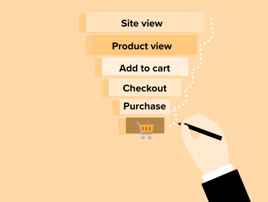
Here are the five stages in a shopping funnel:
- Site visit – A customer arrives at your site.
- Product view – Customer views a specific product page for more detail.-
- Add to cart – Customer shows a strong preference for a product by adding it to their cart.
- Enter checkout – Customer shows strong intent that they will purchase your product.
- Purchase – Customer goes through the entire checkout process and completes the transaction.
To build a highly converting shopping funnel, you need to maximize yield in each stage of the funnel. Finetune the key customer touchpoints and increase revenues this holiday season with these optimization tips for every stage:
Stage 1: Site visit
Website navigation should be easy
Website navigation can either make or break the customer experience. Imagine going through a complex maze without a map or a point of reference. It can be frustrating and overwhelming.
The aim is to have customer-focused navigation. A well-defined structure makes navigation easier and more engaging so users will spend more time on the site. Structure your navigation menu so that it reflects the main categories on your website. Every visitor should know what you do, offer, or provide at a quick glance and without having to search for what they want.
Optimize the mobile experience
According to the KPI Report 2019, 53% of online store traffic comes via mobile devices.
With the massive amount of people using mobile devices to shop and complete purchases online, a mobile-responsive UX is no longer a nice-to-have but essential and critical for any ecommerce website. A mobile-optimized website not only increases leads and sales but also helps increase search engine optimization.
Customers expect the same good desktop experience, but on a smaller screen, which makes it more challenging. So ditch the original full-featured desktop experience with all kinds of animations, long narratives, and huge images that not only make the loading slow but occupy the whole page. A visitor will leave a mobile page after 39 seconds, so make sure that visitors who are accessing your site from mobile devices have an optimal experience.
Boost site performance
A widely quoted study by the Aberdeen Group found that a one-second delay in page load time yields:
- 11% fewer page views
- 16% decrease in customer satisfaction
- 7% loss in conversions
Load times can heavily impact conversions. A study published by Google indicates that visitors are 32% more likely to leave a site if the page takes between 1 and 3 seconds to load. So if your site is too slow, you’ll lose visitors before you even have a chance to market to them.
There are many factors that influence the page loading times. Increasing speed can improve customer experience and can have a significant positive impact on your overall site performance. So spend some time to look through your site’s speed test results and focus on the high-impact issues that will result in easy wins. Even small steps can make a difference and have an impact on your conversions.
Stage 2: Product view
Analyze and optimize your product pages
Analyze the various elements on your product pages and understand what your customers get while browsing through them. Check whether or not your product pages:
- Engage with your customers with a clear product page design.
- Provide sufficient information such as important features and components to help your customers decide on a purchase.
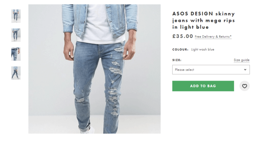
- Present your product clearly with high-quality product photos and a compelling description.
- Include engaging copy that speaks of your brand.
- Load fast and provide an overall good customer experience.
Provide detailed product information
A product photo is important but it’s the high-level product information that informs customers about the benefits and features of a product. This is the part where you can convince them to buy from you. The product descriptions should position your products, target your ideal customers, and foster a strong buy response. Keep them short and sweet and use a clear structure with headings and bullet points to improve readability.
The product page should provide details such as:
- A relevant product title.
- Price and the percentage of discount when applicable.
- Important features, components, benefits.
- Materials and compositions of the product.
- Care and maintenance instructions.
- Size and other dimensions.
- Lead-time if the product requires a longer time to ship.
- Other information about the brand, such as availability, other specifications, and videos or tutorials if needed.
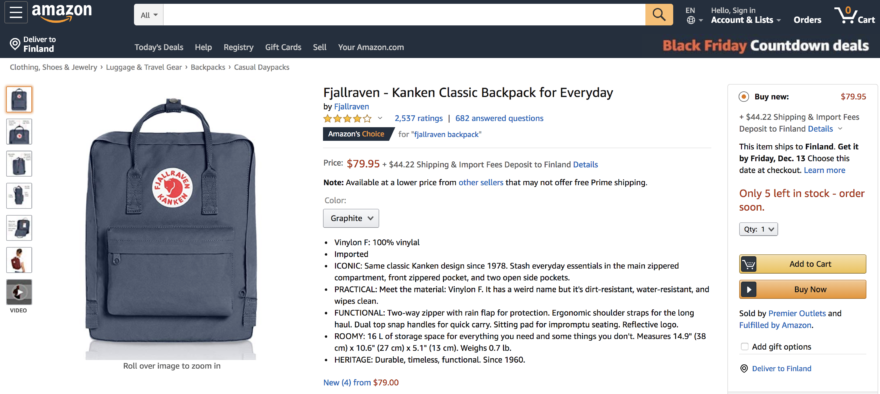
Build and increase trust with customer reviews and ratings
Product testimonials build trust, which in turn increases conversions. They can clear any doubts that your potential customers might have about the products and help speed up their purchase decision. Gone are the days when people rely solely on personal recommendations. Nowadays, many customers prefer to go with social proof such as online reviews and product ratings.
Stage 3: Add to cart
Feature a prominent and clear CTA
Create the perfect CTA (call-to-action) if you want people to buy. The CTA and cart icon should be clearly visible on the product pages. An effective CTA tells customers what they should do next so it should have direct phrases such as ‘add to cart’ or ‘buy now’.
Show that something has been added to the cart
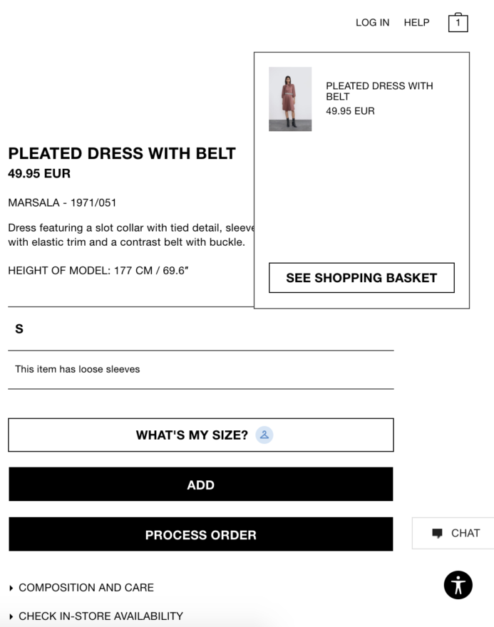
When the shopper adds a product to the basket, give them the right information to eliminate confusion and shorten the time spent in making the purchase. Going back and forth to check what product has been placed in the basket or how many items are already in the cart interrupts the shopping experience.
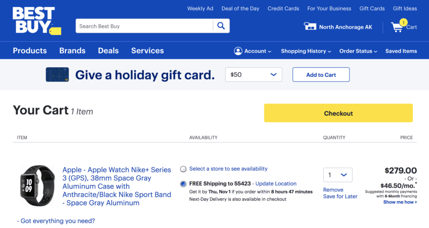
Once a customer hovers over the shopping cart icon it should show the details about what they are buying with a small thumbnail image and a short description. There should also be options to either proceed to checkout or continue shopping. The shopping cart icon should also always display the number of items in it and should move down when scrolling and looking through long lists of items. Customers also need to have an option to easily review what’s in the cart, and edit it if needed, without starting all over again.
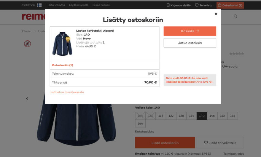
Emphasize free shipping
Free shipping is one of the most important unique selling points and a factor that often prompts a visitor to choose one online store over another. That’s why it’s so important to emphasize free delivery not only on the main page and product pages but also in the cart where a customer is making a final decision whether to complete a transaction or not.
Another option is to have a delivery calculator, like what kids’ brand Reima has, which serves as a reminder to customers of how much more they need to buy to qualify for free shipping.
Offer save or wishlist options
At times, people aren’t ready to purchase yet, even if they’re already halfway through the checkout stage. To save those potential sales, there should be an option to let people save items for later, or move items to a wishlist, so they can later continue the shopping without having the need to hunt down the items they’ve initially selected.
Stage 4: Enter checkout
Checkout conversion is undeniably the most critical metric in any ecommerce business. If your shoppers don’t complete their purchases, none of the rest really matters. But with cart abandonment rising in figures and hitting hard, especially during the holiday season, retailers need to find ways to ensure higher checkout conversions.
Let the customers review the product in the shopping cart
Display the products in the shopping cart in a convenient size and good resolution. Small thumbnail images that you can barely see aren’t a helpful reminder of the products they added to the cart. Aside from the images, show them the details of what they are buying, such as availability, the color they chose, and the number of items they added to the cart.
Full disclosure on shipping costs
Be transparent on the fees right away. Ensure that shipping fees, taxes, and other costs are visible throughout. Shoppers highly value transparency. Any hidden costs, such as taxes, are major turn-offs.
At the same time, make sure that the return policies and other detailed shipping information are also easy to find. If finding the delivery information proves to be a treasure hunt, customers may get frustrated and just give up. Customers should also be informed exactly when they will receive the items and what to do if they aren’t too happy about them.
Eliminate the mandatory sign up and offer a guest checkout
If this is the first purchase from your website, and perhaps the only one, customers are questioning the value of spending a lot of time filling out a signup form and giving out their email address. People don’t want to be forced to create an account because signing up can be a time-consuming effort. Now there are faster registration options, like Facebook or Google login.
So for new customers, they should have the option to check out as a guest, especially for single-item purchases. Or you can allow the checkout page to double as the registration page as well, collecting the name and email. You may also want to include the password field in the checkout form to avoid a separate step in the shopping funnel or the option to generate a password after the order has been completed.
For returning customers, the checkout page should automatically pre-fill their contact information and there shouldn’t be a need to register or enter a password to access the shopping cart. Make it as easy and hassle-free as possible to complete the order.
Create elements of reassurance
Customers judge the security of your checkout process based on how credible your site looks. Doubts and fears are an inevitable part of the online shopping experience and the causes for suspicion can range from outdated layouts to missing images and no SSL certificates. More of a gut feeling, they usually rely on authentication and security logos like ABTA and ATOL for travel or the VISA logo for general ecommerce websites.
But there are a lot of great ways to assure your users that you and your business are both reliable. Your security badges should be clear and visible. A lock symbol in the address bar also indicates security. Potential customers want to make sure that their financial information is in the right hands. They have peace of mind and feel safer when they know that if anything goes wrong, their money will be refunded.
Simplify the checkout forms
Keep the checkout as simple as possible. Reduce the number of form fields and only include the necessary ones. Options for doing this include:
- Use a single field for the customer’s full name, rather than separate first and last name fields.
- Make the shipping address the same as the billing address, unless the customer requests differently.
- Use an address lookup service to automatically find addresses and zip codes.
- Autofill form data from information stored in a browser or password manager.
- Retain customer information so repeat customers don’t have to enter the same info again.
- Automatically copy shipping information to the billing information field if they’re the same.
Deliver relevant, smart, and personalized recommendations
You can recommend relevant products or other similar products to your customers when they’re on the checkout page. Sweeten the deal by offering additional products that complement the item that your customer wants to buy. Consider it as a good customer service because as you encourage the customers to purchase more, it can also help them with their shopping needs.
For example, for a dress, provide options for shoes and other accessories that match the dress. Personalized recommendations offer a more customized shopping experience, making customers feel more valued. To learn more about this topic, have a look at the comprehensive guide to recommendations.
Stage 5: Purchase
Conduct on-site surveys
The timing of surveys is critical, especially if you want to get the best response from customers without distracting them from their purchase journey. The surveys will give you greater insights into what customers feel, what their goals are, and what their pain points are. The results will help you craft a better, more relevant, and highly-targeted message.
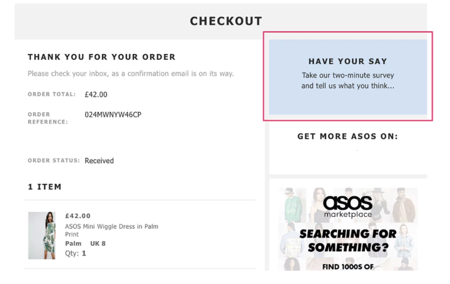
A survey on the order confirmation page can usually yield more results because people who just bought something are more likely to answer questions about their experience. But this also means you won’t get feedback from those who didn’t purchase. In these cases, you can trigger a survey when customers are about to leave the site or abandon the cart. These are the two common on-site surveys:
- On-page surveys are activated when a visitor visits the page, either immediately or after a set period of time. One example is the survey on the purchase page when the order has been completed.
- Exit surveys are activated when the visitor shows exit intent, like hovering over the browser’s taskbar and abandoning a cart. The survey will give you the chance to gather feedback from potential customers before they leave.
Turn them into returning customers
Once customers have made the purchase, they’re excited about their order. So the best time to promote your loyalty club is right after they bought something. Having a loyalty program is a great way to encourage repeat purchases and increase customer loyalty. In fact, according to one report, repeat customers spend 67% more than new customers. Offer them discounts such as 10% off or free shipping on the next purchase.
Get those cart abandoners back
Letting shoppers abandon their carts is one thing, but not trying to win them back is another. A website visit normally starts with “window shopping” and it’s in your hands to turn random visitors into buying customers.
Customers may add items to their baskets but, when life gets busy, they leave abruptly and forget all about it. A brief but impactful abandoned cart email is an excellent way to remind people to come back and purchase their abandoned items.
At the same time, you can also let them know that their items will stay in the shopping carts for a certain amount of time, say two weeks, in case they decide to come back and purchase them. Imagine a customer going back to your site after a day or two to finish the checkout, only to find out that all the items in the shopping cart are gone and that they have to put everything back in the cart.
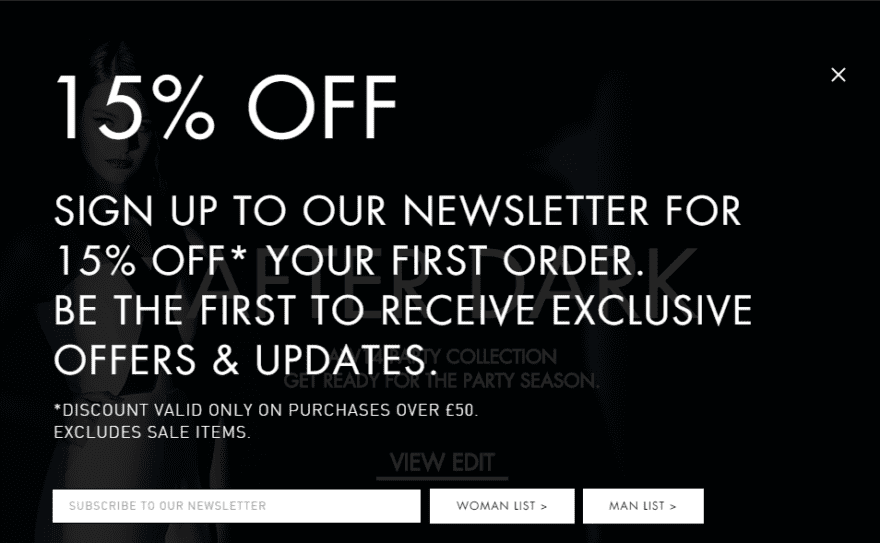
You can also use an exit-intent popup when customers attempt to leave without purchasing. Give them a reason to complete the checkout process. Offer discounts, coupon codes, or some freebies.
The secrets to a highly converting shopping funnel
Identify leaks in your shopping funnel
Let’s visualize a real funnel and think about how it works. When you pour water into it, all of the liquid contents will be forced through the small hole of the funnel, right? In this metaphor, the water represents the potential customers. And if this is the case, then everyone will become customers. But as we all know, that’s not really true.
Now, imagine there are tiny holes in your funnel. Water then starts leaking slowly and as you reach your destination, you’d probably be left with just a cup of water. Think now of how the water, or your potential customers, move through the shopping funnel. In most cases, only a handful of those who enter your funnel make it to the bottom. Along the way, there’s always an opportunity for water to escape through the holes. So the question is: Should you start going back to get more water, or should you spend time to repair the leaky funnel?
The thing you need to constantly remind yourself of is that the funnel will always have holes. You’d fix one only to find out that there are two more new holes. If you can effectively plug the leaks as you spot them, the funnel will be more optimized. Don’t concentrate on getting more water, or sending more customers into the leaky funnel, instead, focus on ensuring that the funnel is in good working condition. It will require a lot of work and constant maintenance, but it will be worth it.
Test, test, test, and test again
A lot of work has been put into your shopping funnel, your content, and your UX. What’s next? It’s time to analyze the different metrics such as click and bounce rates, conversions, and website traffic at each stage of the shopping funnel. Multi-armed bandit experiments and A/B testing can help you identify any unanticipated obstacles.
For example, you can run a test on your checkout page where users have two options: either click ‘Sign up today’ or click ‘Log in’. When you have the data to back up, you can test different variants, make necessary changes on images, copy, and CTAs, to see how these impact conversions. Set up tests and experiments to find out what’s good for your ecommerce store and start optimizing your product pages and checkout pages.
Continue to build, analyze, and optimize the shopping funnel
Although building an optimal checkout flow isn’t a one size fits all and there may be different solutions for each site, the principles are universal. Having a well-performing shopping funnel in ecommerce and in any industry is crucial to turn potential customers into loyal customers.
Having a proper and well-structured shopping funnel is essential to any kind of website. Improving your overall site experience and shopping funnel is an ongoing process. You have to continuously analyze, change, and optimize it with smart strategies to give customers the best experience as they move closer to the end goal.
At the same time, improve on your website personalization strategies and tactics to make sure that this holiday season is indeed the best time of the year.
Download the personalization ebook
Includes insights, examples, and practical tips for different industries, such as retail, media, and iGaming.