How to personalize and optimize category pages to maximize profitability

In a supermarket, it can take you an hour to go around the endless rows of products – even with the large square signs hanging above every aisle – to find the pasta sauce you want. In digital retail, category listing pages act as virtual aisle signs. After the front page, they are usually the very next step in the shopping journey.
Category pages are crucial to product discovery, serving as sources of traffic from search engines or paid ads. But most category pages are not effectively optimized and use simple sorting methods that don’t cater to multiple audiences. You may be tempted to display all your products on a single page, but showing everything on this limited screen real estate can also backfire. Visitors who can’t find the right products effortlessly will leave the site.
Category pages play a critical role for any ecommerce business. Therefore an effectively optimized and personalized category page:
- Offers a relevant experience to every visitor and tailors content to specific preferences and intent.
- Improves the visitors’ overall shopping experience and shortens their time to purchase.
- Delivers a good foundation for SEO to generate traffic from landing pages.
- Increases product discovery.
- Enables visitors to narrow down the number of interesting products, making decision-making easier and the likelihood of purchase higher.
Optimizing category pages
Before personalizing a category page we need to optimize the aspects of the page. This means grouping and presenting products in such a way that a visitor can easily find what they’re looking for and immediately get the relevant information about the products.
So how do we achieve an ideal category page? Let’s go through these aspects:
1. Listing of products and narrowing down the lists
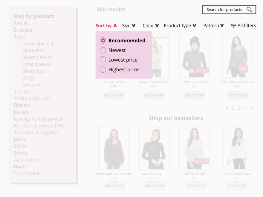
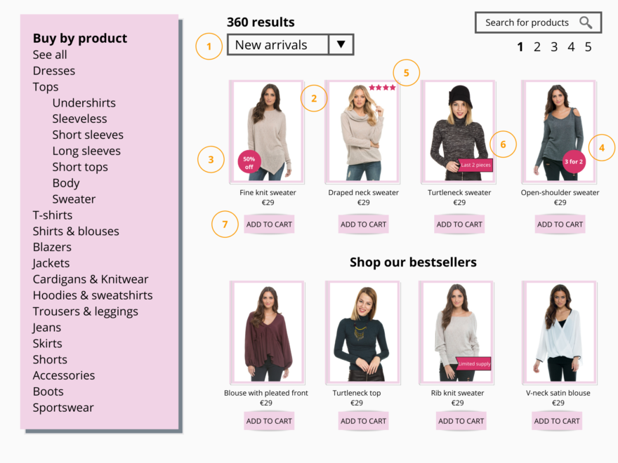
When you list the products, emphasize on what the visitors see first. There should be a good wide range to choose from between products, such as budget, size, or other features. Give the visitors easy accessibility on narrowing down the product list so they can quickly choose which product to purchase. They should also be able to sort products according to their needs and requirements. Some sorting examples usually used in ecommerce stores include bestsellers, customer ratings, new arrivals, and price. You can use these tools to narrow down the product lists:
- Categorization
Categorization means grouping products in broad and generic categories. For example, women’s clothes categories can comprise dresses, skirts, and tops. You can divide categories further to subcategories. For example, dresses can be further divided into party dresses, casual dresses, and office dresses. Effective categorization enables visitors to easily choose the best option. - Filtering
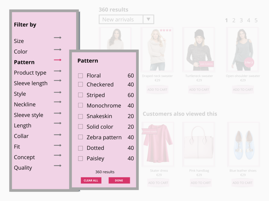
Once your categories and subcategories are in place, you can apply filtering. It allows visitors to refine their search based on various properties, such as size, color, and price, as well as more specific product attributes, such as material, style, or length. - Search
Keep the search function simple, specific, and intuitive, so that visitors can easily find the exact product they want. Customers can find nearly any product imaginable online and get it delivered to their home within the week. The search box should be prominent enough for a visitor to easily enter their query and double-check that the query is error-free.
2. Clear product photos
Using clear photos that showcase the products well gives your visitors a better idea of the product. The style of the photos should be consistent across all product categories as much as possible.
- An appropriate number of products in a row and on a page
To avoid confusion, keep the number of products to a minimum if the products require a lot of space or information. On the other hand, fewer products may also indicate a lack of variety, so try to gauge the number that works best on each category page, depending on the products you want to showcase. You can also provide a drop-down list to let visitors choose how many products are shown on a page. - Highlight special offers and promotions
To entice customers with good deals, highlight products on discount. You can add icons to indicate free shipping, or emphasize products that are on ‘buy 1 take 1’ offers. Show the sale price or the discount percentage in a different color so that it stands out. - Display product ratings and customer reviews
If a product is highly rated or recommended by other visitors, you can use an icon, such as a number of stars, to show the rating of the product. A high rating adds credibility and makes visitors more inclined to purchase the product. - Add calls-to-action (CTA) that create a sense of urgency
To create more demand for your product, add a CTA that encourages visitors to buy immediately. For example, you can use urgent CTAs on your category pages indicating that time is running out for a great deal, such as ‘limited supply’, or ‘few products left, or ‘free shipping only today’. - Allow visitors to add to cart easily
Make it easy for visitors to add a product to their cart or wish list with a single button click. Visitors not wanting to spend a lot of time shopping will thank you.
Personalizing the category pages
Once your ideal category page is ready, it’s time to start building a relationship that goes beyond the computer screen. You achieve this by making the digital journey focused and clear through personalization. Here are some best practices for category page personalization:
1. Reorder thumbnail images to create personalized category pages based on user affinity and behavior
If a visitor has viewed particular brands, colors, or styles on your site prior to landing on a category page, you can use this information to reorder the category page just for them. Instead of showing the most popular products, you can leverage the visitor’s behavioral data to place the products they are interested in at the top of the page in the most visible position.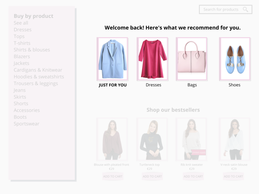
With limited screen real estate, it’s critical to immediately show relevant products, especially on mobile, where the visitors’ attention span is usually very limited. Tailor the product listing pages (PLPs) according to each visitor’s behavior and preferences. Strategies can include:
- Color variants based on visitor preference
- Abandoned items
- Recently viewed
- Popular items from visitors’ favorite subcategories
- Category variety for new visitors
- Bestsellers
2. Utilize past purchase information to automatically recommend the most relevant products
When a visitor connects with your brand for the second time, they’ll feel valued if you recognize them. If there was a previous purchase, the next challenge is to trigger another one, be it a replenishment product or a complimentary item. Use the combination of AI, context, and insights to understand visitor behavior.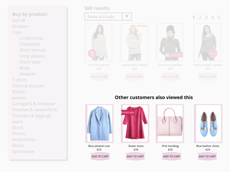
Recommend items complementary to the products that the visitor has already purchased. Use recommendation strategies, such as “Customers who bought this also bought” or “Shoppers who viewed this also viewed”.If a visitor comes to your site and looks at several summer dresses, when they return, it shouldn’t be on a generic category page filled with your most popular dresses. Instead, they should return to a category page that ranks dresses based on the style they looked at or purchased previously. In this case, summer dresses should be at the top of the page.
3. Use A/B testing on category page filters and sorting tools

For retail ecommerce businesses with a large inventory, optimizing product discovery is important to help visitors find exactly what they’re looking for. Continuous testing can better facilitate the user experience. Experiment on different menu styles, number and order of the filters, placement, and so on. Find out which solution showcases more products and make it easier for your visitors to find them.
4. Optimize the navigation of the page

With thousands of brand offerings, finding the perfect product effectively can be tedious. Navigation becomes an essential element of the website, and that goes for category pages as well. A search menu on category pages can improve product discovery and increase add-to-carts and purchases. Add search filters to improve product discoverability and help the visitor navigate more easily through the product categories. By monitoring their site behavior such as product views and search queries, you get insights that you can use to personalize category pages based on visitor preferences.
5. Highlight product feed filters based on visitor affinity
Browsing a category page can be overwhelming with so many filters and sorting options. To optimize the visitor experience and increase visibility on relevant products on category pages, use affinity data to highlight the visitor’s most popular filter type. You can use a dynamic banner prompting them if they’d like to reapply the previously used filters, such as color, price, or style.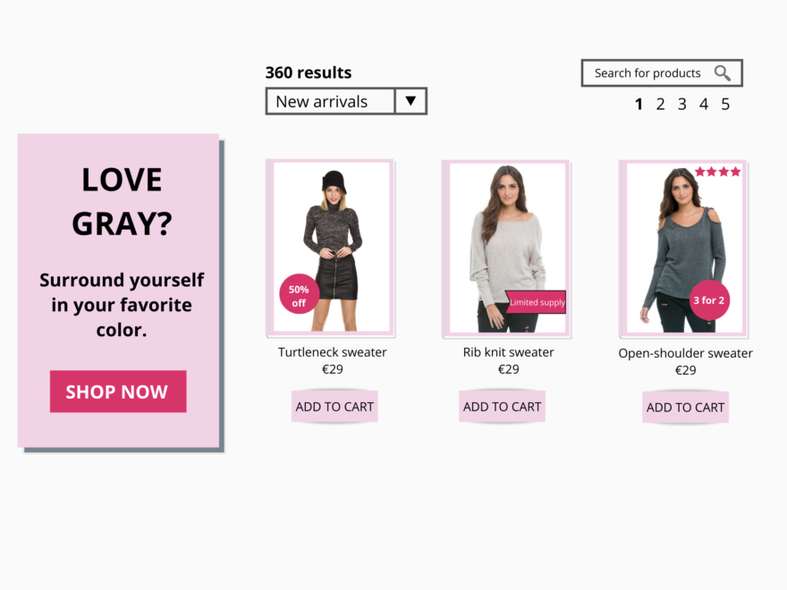
6. Create personalized filters based on visitor affinity to simplify the navigation
When visitors aren’t sure of what they want, going through several category pages and filters can be time-consuming. Reduce the barrier between searching and buying by personalizing the navigation experience through personalized filters for each site visitor based on their unique affinity.
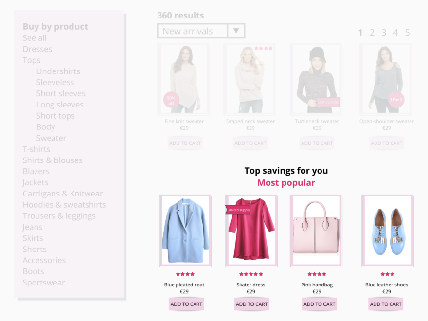
7. Personalize the category pages for first-time visitors
How do you personalize a page if you don’t know the visitor, or don’t have behavioral information about them? Leveraging the popularity of products has been proven to yield great results for first-time visitors who haven’t yet expressed any interest in a specific product line.
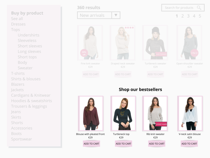
At the same time, you can use these contextual signals to create a relevant experience the minute a visitor lands on your page:
- IP address, which provides their most likely geographical location
- Operating system
- Inbound link
- Season and time of day
With the ecommerce marketplace becoming more crowded plus increased expectations of today’s consumers, ecommerce businesses must keep up with the competition by providing websites that are easy and enjoyable to browse. Personalized category pages can help you stand out from the competition by capturing the micro-moments of ecommerce shopping. And with today’s technology, category pages can offer an engaging and unique experience by responding to each visitor’s intent in real-time.
The category pages also receive a big share of your site’s traffic, especially from Google searches. Therefore, improving category pages that list various products is crucial for ecommerce companies. Ecommerce businesses should provide websites that are enjoyable to browse and ensure that the category pages are simple, clean, and easy to navigate.
With an AI-powered personalization solution that uses numerous data points, ecommerce businesses can create individualized category pages, learn more about their visitors with each interaction, and improve the customer experience in real-time, leading to impressive results. Visitors are more likely to spend money and return to a site that makes them feel valued with personalized offers that are tailored to their needs. Start delivering personalized experiences on front pages and product pages.
