Quick personalization fixes to bring better results faster on front and product pages


Maija Erkheikki
In this turbulent year, there’s a huge surge in online orders as customers are forced to go digital. With the peak sales season around the corner and retailers moving online, are you prepared to surpass your best sales record?
Customer journeys are not linear and it might take several visits before the conversion is accomplished. For many years now working with numerous ecommerce sites, we’ve seen so many things that you can do on front and product pages to improve conversions.
In this blog post, we introduce the easiest best practices to make your front and product pages convert more while creating loyal happy customers.
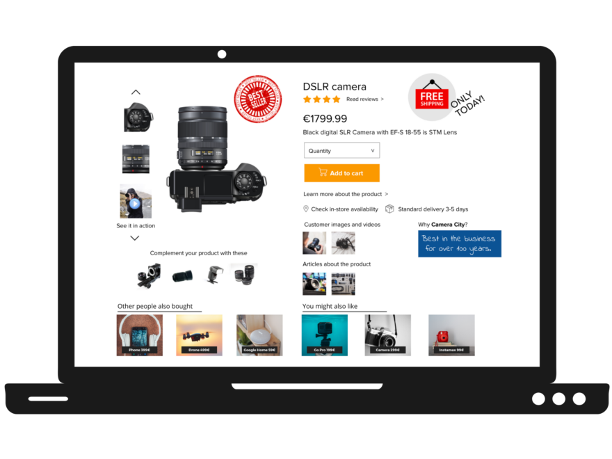
Product page – make sure it’s not a dead-end

The product page is often the landing page where a potential customer lands after searching and selecting a product for a closer review. But quite often, the customer journey does not end there. What happens if the product is not quite what the visitor wants? Or what if the product isn’t available?
Most of the time, the product page is a dead-end that doesn’t give the option to continue exploring the site. As a consequence, you lose the buyer to your competitor. Give your visitor some recommendations to find better suitable or alternative products. We always recommend having three sets of recommendation strategies on the product page such as
- Find similar products
- Most popular from the brand
- complementary or optional “You might like these”
Best tactic: Give your potential customers options to continue the exploring phase of the customer journey from the product page.
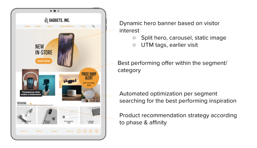
Front page – make sure it’s not static
The biggest mistake that online stores do is showing the same static front page to all visitors without segmenting them into groups based on interest, behavior, and historical data.
The beauty of the visitor’s repeated visits to your site is that with every visit, you can collect data to create a more personalized shopping experience.
Our data and experience show that when the visitor returns to the site, the journey usually starts again on the front page. So the question is, how does the front page help the second or third-time visitor continue their journey as friction-free as possible?

There are several tactics:
- Feature the product that highlights the customer’s interest in your hero banner.
- Show tailored product offers or CTA’s according to the customer journey phase and product interest.
- Use inspirational content according to the product interest, for example, content that needs to be taken into account when choosing the right product.
- Deliver product recommendations according to the interest and customer journey phase.
Believe us – it’s fast and easy
To make things easy and fast, let Frosmo’s personalization software do the tricks on your online shop by creating personalized customer journeys.
Frosmo’s winning formula in delivering the best personalization results in the market is based on a unique combination of the following key features:

Read more about our best practices in personalizing the entire customer journey on different web pages as well as our customer cases.
About the writer:

Maija Erkheikki has over 15 years of experience in the international software industry and is driven by a passion to use technology to improve the quality of life. This passion was best exemplified in her role as a consultant for healthcare companies, working on business processes and performance management. This led to a career in the partner-driven software business, where it is critical to build win-win-win models. Currently, she is fascinated by the digitalization of commerce and how artificial intelligence reshapes all industries.