Optimizing and personalizing your website front page

The front page of your website is the gateway to your business, the virtual front door where visitors decide if you are worth their time or not. Because you only have a few seconds to impress them, think of the front page as an applicant interviewing for a job. People put their best foot forward to land their dream job, and so should you with your visitors. When a new visitor arrives at your front page and proceeds to browse through it, they start questioning what you can offer, criticizing every detail they see, and trying to identify if you are the best fit for them and worth their money.
The front page gets the majority of a website’s traffic, but many businesses still find it challenging to effectively optimize and personalize them. The front page may be just the first step in the shopping funnel, but it can lead to a lasting impression on whether a visitor should stay engaged or leave the site.
So the question now is:
Is your front page making the right lasting impression?
To ensure that it is and that your visitors are engaged from the start and stay on your site, your front page should be both optimized and personalized.
Optimizing the front page
The basic elements of an optimized front page are: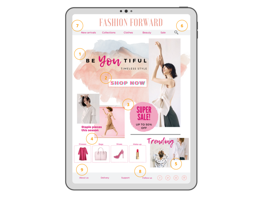
1. Unique value proposition supported by visuals
Your value proposition is your elevator pitch. Short and precise, it needs to immediately communicate what you can offer to your visitors and why they should choose you. A picture is worth a thousand words, so make sure that your photos and images resonate: for example, choose engaging photos that add credibility, such as a person wearing your clothes or using your products.
2. Call-to-action (CTA)
The front page should pique the visitors’ interest, prompt them to explore your site, and ultimately make a purchase. A good CTA pulls visitors in, sends them deeper into your site, and drives them to the end of the shopping funnel. It’s the ultimate action that converts a visitor into a customer.
3. Promotions/offers/inspiration
With most retail stores having almost the same offerings, how can you stand out? Highlight your product collections and showcase inspirational looks of the main product offerings to entice visitors to start shopping. Promotions are also a great way to encourage visitors to stay on your site instead of jumping to your competitors’ websites.
4. Key categories
Help your visitors find exactly what they want on your website. Showing your key product categories on the front page will give visitors a glimpse of what they can purchase from your site. Make the categories compelling and visible, and make it easy for visitors to reach individual product pages.
5. Popular/trending products
Product recommendations on the front page should both inform and engage new visitors, so recommend the hottest products or ones that stand out from the competition, those that have ranked best on your site in different categories, bestsellers, or trending.
6. Easy-to-locate search feature
A search box is a valuable asset to include on your front page, especially if your website has a lot of content. Use a standard and clearly visible search icon to allow your visitors to easily find the products they’re looking for.
7. Clear-to-follow navigational structure
The navigation menu should be straightforward, intuitive, and easy to locate. Think of it as a road map that visitors use to find the shortest route through your site. A good and thorough navigational structure gives the visitors an overall view of the content and a clear path into your website and helps them easily locate the information they want. A good structure also helps reduce bounce rates and increase conversions.
8. Trust and social proof
Today, a good social media presence is a prerequisite for a successful ecommerce business. People want to see that you are visible online. Providing links to social media accounts is a great way to encourage visitors to engage with your company through another channel.
9. Footer: About us, delivery, and other information
When your visitors reach the end of your front page, they should see a little bit more than your headline or your value proposition. It could be something about how the company started or a short story of how it was founded. Contact information encourages the visitors to get in touch with you and gives them more security and assurance, knowing that if anything goes wrong, they can easily reach you. At the same time, delivery information should also be easily accessible, so potential customers know their delivery and refund options.
Personalizing the front page
The front page is often a landing page from marketing ads, which marketers spend so much time and money on. According to a report done by Marketing Charts, front-page personalization has remained the second most popular type of personalized experience. The front page should be designed to serve different audiences from different origins. It cannot just be a generic landing page built around one message for all visitors.
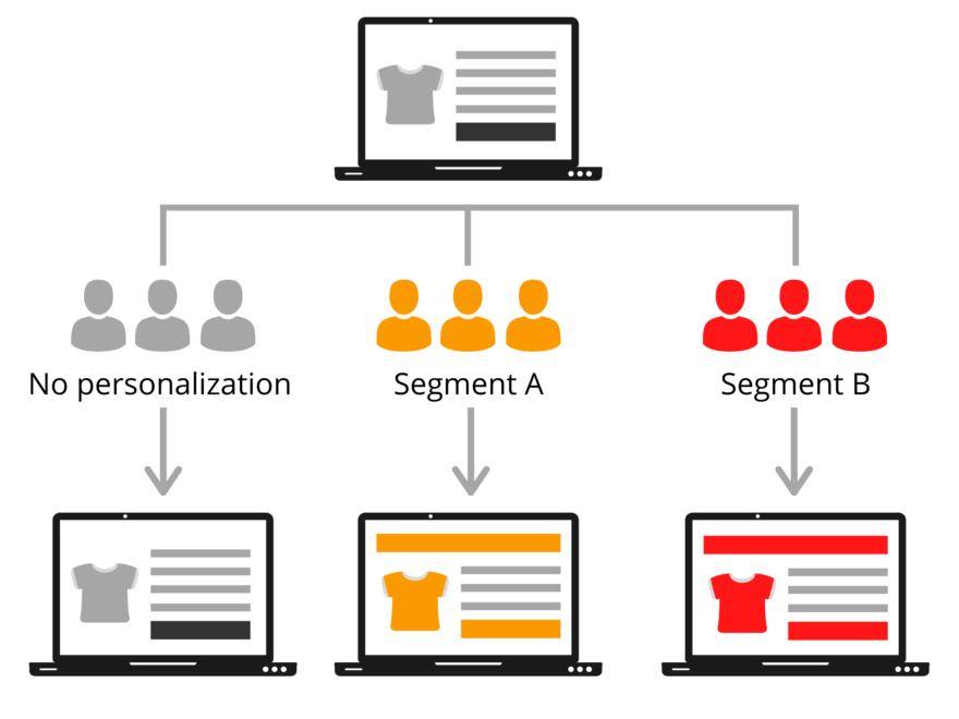
The problem that most businesses share is that they have only one version of the front page catering to all visitors. But every visitor is unique: each comes to your website with their particular background, expectations, and needs. Their experiences with your website should reflect this uniqueness. Instead of a one-size-fits-all solution, the content on your front page should vary based on who’s viewing it and what you know about them based on the data you’re tracking. Personalizing the page for your visitors makes them feel like you know them and what they want.
A properly personalized front page will yield the following benefits:
- Improve engagement
The visitor wants to quickly find the products that they are interested in, while you want to engage the visitor and make the awareness journey easy, relatable, and intuitive. With personalization, you will both strengthen the relationship with returning visitors and find out faster what works the best for new ones. Your visitors want a sense of belonging and a reason to buy from you. Part of front-page personalization is a sense of connection – providing the right kind of content and balance for each customer about your brand, your credibility, and social proof. With the right personalization tactics, you can immediately capture the visitor’s attention and engage with personalized content based on past shopping behavior.
- Increase conversions
The visitor wants to quickly find the products that they are interested in, while you want to engage the visitor and make the awareness journey easy, relatable, and intuitive. With personalization, you will both strengthen the relationship with returning visitors and find out faster what works the best for new ones. Your visitors want a sense of belonging and a reason to buy from you. Part of front-page personalization is a sense of connection – providing the right kind of content and balance for each customer about your brand, your credibility, and social proof. With the right personalization tactics, you can immediately capture the visitor’s attention and engage with personalized content based on past shopping behavior.
- Improve lead quality and support ABM (account-based marketing)
Using personalized campaigns that focus on highly tailored experiences can drive engagement with targeted accounts and increase the number of quality leads.
Optimization and personalization work best together
Once you’ve optimized your front page, you’re ready to personalize it. Implementing personalization strategies may seem tedious but considering the tools that exist today, it’s no longer impossible to achieve.
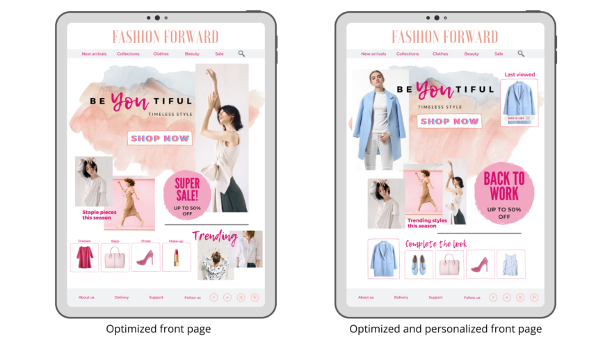
From dynamically updating a hero banner based on recently viewed or previous purchases to showing a recommendation slider or carousel with relevant products, efficient optimization combined with effective personalization is the key to unlocking the most revenue from your front page. Since you can now collect a lot of data about your visitors and really get to know how they behave on your site, it’s vital to make use of this possibility. Landing every visitor to the same generic front page limits your ability to convert more visitors and increase revenue.
Here are the best practices for optimizing personalization on the front page:
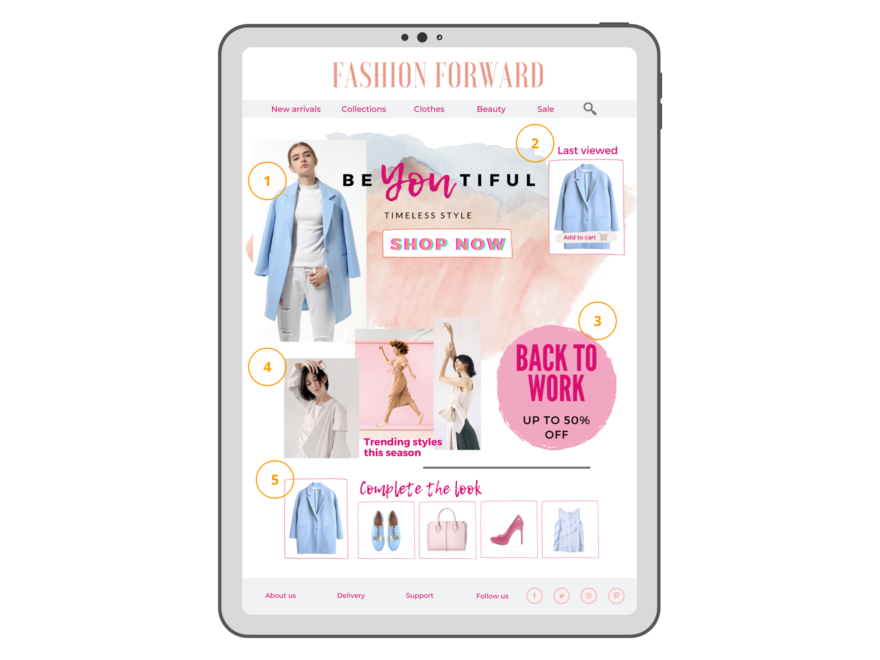
1. Automated segment-based optimization of the hero banner
The hero banner on your front page shouldn’t be the same for all visitors. The banner should be customized according to each visitor’s current phase on their customer journey. With second-time visitors, for example, you already have some behavior data available, so you can personalize the banner for them on an individual level.
2. Returning user last viewed product
For returning visitors, since you already have data about their shopping behavior and browsing history, use personalized product recommendations. For example, if a visitor previously bought a dress, try recommending an item that complements the dress, such as a pair of shoes or a bag. To boost sales, when visitors browsed your website previously but didn’t make a purchase, help them pick up where they left off by showing their recently viewed products.
3. Best performing offer within the segment/category
You can group your visitors into segments based on their preferences and customize your offers for each segment. Personalize according to the contextual segment, that is, gender, location, interests, weather, and so on. Use contextual recommendations such as “Trending in your area”, “What’s new”, or “You might like”. Test out different versions to see which one works best. Conduct A/B testing regularly so you can bring in more targeted leads by doing what works and changing what doesn’t.
4. Automated optimization per segment searching for the best-performing inspiration
Utilize AI-driven optimization to dynamically search for the best-performing inspiration or recommendation strategy for a specific visitor segment and automatically verify its performance.
5. Product recommendation strategy according to customer phase and affinity
Product recommendation strategies on the front page mainly consist of highlighting the most popular products, but with the data on hand, you can then find the best products to present to each customer accordingly in every phase of the customer journey. Every visitor is exposed to the most relevant product recommendations at the top of the front page when using an affinity-based strategy.
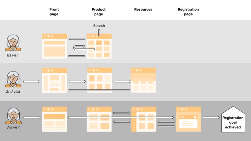
The front page plays a key role in customer journeys. The image above visualizes a three-session customer journey on a content-driven website, where registration is the end goal. The beginning of the second and third sessions are the most underserved points of the customer journey. When a customer returns to your site, you should help them pick up where they left off instead of showing the standard home page. Try providing content that is popular among other visitors, currently trending content, or even pieces of content the visitor has previously read.
Success for any brand that wants to acquire and retain customers now lies in the ability to tap into and understand the needs of website visitors throughout the whole customer journey. But for truly one-to-one customer experience, personalization should extend far beyond the front page. Category and product pages can also be personalized to reflect each visitor’s interests and lifecycle stage. Your customers will be happy, which also means your conversion rates will soar.