Product page personalization through AI-driven recommendations

Website personalization is incredibly important. We all know that customers are more likely to buy from an online store that provides personalized experiences than from one that does not. Personalization is the core part of the experience that online businesses provide and aims to perfect the customer experience.
Recommendations remain as one of the most powerful tactics to personalize product pages. Using recommendations on product pages aim to increase average order values (AOV), but also to keep the customers in the sales funnel.
Why personalize the product page?
First, it’s important to understand how a customer arrives at a site. Data suggests that about 20-35% of retail website traffic lands on product pages since most people shopping online use search engines and follow ads. Hence, a product page is often the first step in a customer journey where they spend the most time browsing and choosing the products they want to purchase.
People who land on product pages have a clear need they are looking to fulfill, so this presents a good opportunity to begin a great relationship with them. Personalization on product pages enables retailers to reach out to customers in a way that directly and precisely meets their needs and desires. It’s about giving your customers more power, and reasons to come back for more.
Product pages are also an important part of SEO and SEM, and getting the best out of product pages will improve ROI of your campaigns. Personalization on product pages, combined with SEO best practices will improve the site’s visibility and ranking on search engines and will put it on the fast track to success.
Product pages have a significant long-tail impact on your business through products that are not best-sellers and usually not visible in standard recommendations. A clear strategy in personalization will keep you focused on your goal: whether to offer complimentary items to increase the average order value, or whether to offer alternatives to help improve conversions. Most companies use a hybrid of strategies that can be A/B-tested to achieve the best of both worlds.
Typical goals for product page personalization
- Aim for more product page clicks, views, conversions, and reduce bounce rates
- Make it easy to view all comparable products in the category
- Enrich product information with other useful insights
- Create trust and affinity by presenting relevant content to start the customer journey
- Present more options for customers who land on product pages
Recommendation strategies on product pages to maximize your success
Make sure you have the basics of a product page covered
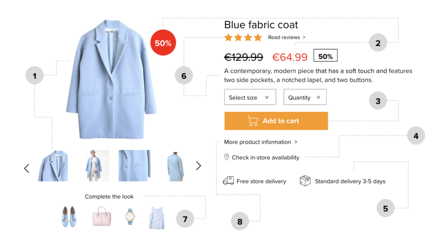
- A great-looking product image on a white background that loads fast, with easy clicks to the next image and as many product images as are available
- Price should be seen immediately and clearly, with discounts highlighted, in numbers and percentages, if possible, also in the corner of the product image
- CTA (add-to-cart) should be visible and as high as possible, and sticky on mobile
- Product availability
- Delivery information is crucial so it has to be clear and visible
- Product rating and reviews by other customers, options and very short description next to the image on the desktop, below the image on mobile
- Product recommendations
- Further product information
Leverage the powerful features of a product page
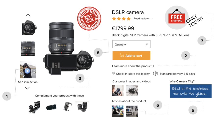
- Product videos
- Links to the product catalog or information and other product reviews around the web
- Additional recommendations: complementary products if available,
- Information about your company and why to choose you
- Customer images and customer videos
- Articles, blog posts, other content about the product
- Sense of urgency or fear of missing out on some features, for example, prices or free shipping available only at a certain time, or only a limited number of products left
- Social proof features such as products that other customers have bought recently or bestseller tags
Utilize the exit intent feature
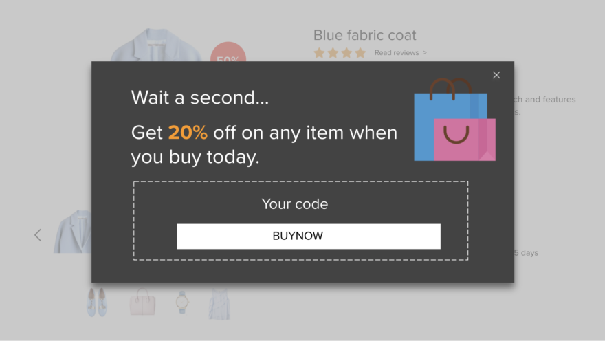
If the customer is about to leave the product page, personalize the experience with the exit-intent feature. Use an exit popup when the customers attempt to leave without purchasing. Give them a reason to complete the checkout process. Offer discounts, a coupon code, or some freebies.
Exit intent can be:
- A pop-up, ribbon, drop-down, etc.
- Asking for an email address to let them know of the future similar offers.
- An offer of a discount coupon for other products
- Testing another recommendation, for example, a best-seller product within the category.
Take advantage of the 404 error page
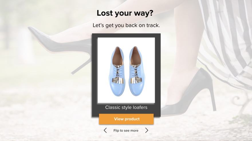
If your customers end up on a misspelled URL, a broken link, or a product page that doesn’t exist anymore, make something good out of an almost bad shopping experience. These 404 pages are still part of your online store, so create a nice-looking page and offer other products. Test different recommendation strategies, and add an image describing your brand and your value proposition. An optimized and well-strategized 404 page can help you convert visitors into customers and perhaps convince them to sign up on your email list.
Maximize the impact of the product page on the homepage
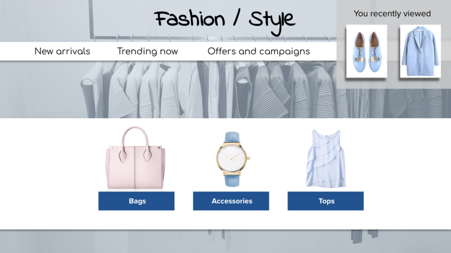
Traditional customer journeys no longer exist. Today, customer journeys are non-linear and unpredictable. Customers don’t end up buying a certain product the first time they visit a particular site. Brands need to realize this new reality and take engagement to a deeper, more complex level.
One of the most unused personalization features is the impact that a product page visit should have on the homepage. Many customers are more interested in browsing than looking for a specific item. Even those who do have a particular product in mind may change their mind after learning more about it.
Customers will usually look at more than one product page during a single session so you can remind them of previously viewed items. For example, a customer has visited a product page and after a few hours or days, returns to or visits the same site, but this time, the front page. To increase conversion rate, the front page hero banner should scale and the last viewed product is visible on the right side of the homepage. This is a great way of targeting new potential customers with customized recommendations.
Front page recommendations should also change accordingly. You are in the best position to offer the most relevant content. For first-time visitors on your site, you can recommend the most viewed or trending products but for second visits, you should remember and show the products that the customers have viewed recently.
Use a strong call-to-action, say “Pick up where you left off” to remind the customer about the items from the last session and deliver an uninterrupted shopping experience. Recommending similar products, and other new brands, trending items, and other categories to explore, based on my recent browsing activity.
Ensure conversions of add-to-basket
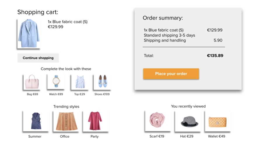
Directing the customer to a new page once a product has been added to the basket can increase AOV. On the top of the new page, there’s a summary of what has been added to the basket and a possibility to check out. The rest of the page is filled with different recommendations, about 5-8, of which the first ones should be complementing products/features. The others should show a broader set of products available. At the bottom of the page, there should be recommendations about previously viewed products.
You can recommend the bestsellers, or if the customer has purchased several dresses in the past, you can recommend other similar styles that she might like. The upsell could also be items that go with the products they want to purchase or have already purchased. By including category suggestions, you will broaden their choices as widely as possible, and increase the likelihood that they see an option they want to explore further.
Increasing customer lifetime value with personalized overlays
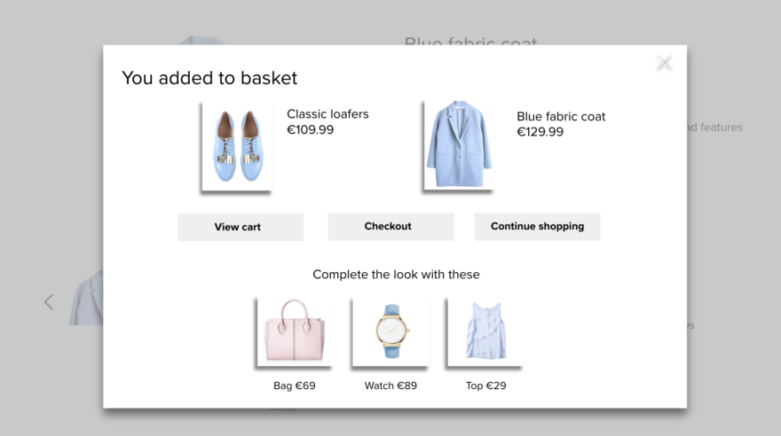
A powerful alternative way to increase AOV is to load an overlay on top of the product page. This overlay confirms what has been added to the basket and recommends complementing/matching products. The overlays need to be relevant to the customer. Target each customer with something relevant to them to push them into the action you want them to take. You risk losing a potential customer if you interrupt the customer journey with a random ad about something they don’t really want. Learn more about your customer, and focus on driving the action that you want them to take.
Personalize every touchpoint through smart product recommendations
You don’t need to redesign your whole ecommerce site to offer customers personalized experiences. One of the best approaches is to add lots of small but powerful elements that together transform the way that new and existing customers interact with your website. Utilize personalization through recommendation tactics on product pages. Engagement will deepen, sales will grow, and revenues will increase.
It’s not easy to create messages and offers that feel truly personal and relevant to potential customers, but utilizing personalization through smart recommendation strategies can become a very powerful marketing tool with many benefits to both customers and businesses.