Best practices on personalizing the entire customer journey on different web pages

You and your customer have the same goal. You both want the customer journey to be easy, intuitive, seamless, and as friction-free as possible. How can you make that happen?
The answer is customer journey orchestration – a smarter way to visualize and optimize customer journeys from start to finish. For B2B companies, the customer journey and personalization practices look a bit different.
Customer journeys are not linear but rather a maze of repeated visits, pieces of consumed content, and other actions. Visitors come from different circumstances and have varying needs for information. To have a meaningful impact on the customer experience, you need to manage the entire customer journey, optimize it, and personalize it accordingly.
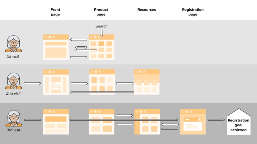
Let’s take a closer look at a typical customer journey in an online retail store, and how to apply personalization in each phase of the journey. We’ll walk you through the best practices and practical examples of how you can deliver smart and effective personalization on different types of web pages.
Personalizing the front page
A great customer journey starts with content that builds credibility. Your front page should have good content and should also showcase available promotions and other interesting offers. Instead of a one-size-fits-all solution, the content on your front page should vary based on who’s viewing it and what you know about them. Personalized recommendations on the front page make the revisiting buyer feel more welcomed and create a smoother buying process.
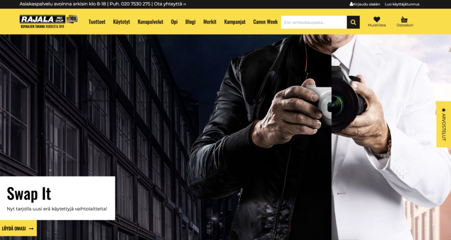
The front page of Rajala, a Finnish photography specialist retailer in business for 100 years, shows generic content for first-time visitors, and content customized according to the interests and behavior of returning visitors.
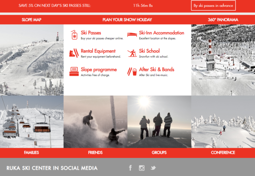
For Ruka, one of the leading ski resorts in Finland, personalization starts with segmenting visitors: customers who show interest in going to Ruka and travelers who are already in the area. There are two seasons in Ruka, winter, and summer, and they attract very different types of visitors. The customer segmentation data is used to display personalized content to push events, ancillaries, such as ski lift tickets, and accommodation options.
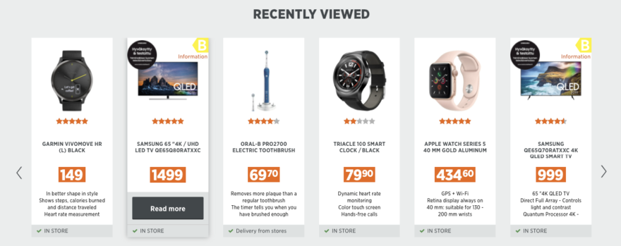
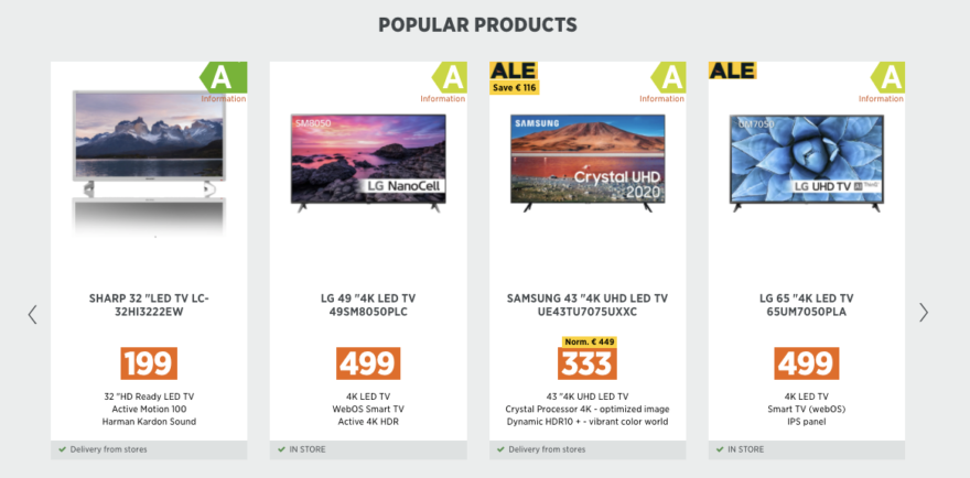
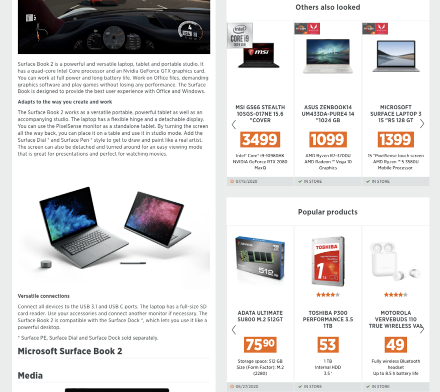
The strategy of Power, a leading electronics retailer in the Nordics, is to assist the customer journey for better product discovery and conversion on the front page. Recommendations show the currently most popular products or products recently viewed by the visitor.
Personalizing the category page
The next phase of the customer journey is discovery or decision-making, where the retailer strives to help customers find and select the right product within the group of nearly similar alternatives. It’s also a good opportunity to recommend complementary products for up-sell and cross-sell conversions.
Category pages are crucial to product discovery, serving as sources of traffic from search engines or paid ads. After the front page, they are usually the very next step in the shopping journey.
Power aims to help the visitors find the most relevant product to purchase in the category pages. Two strategies are in place to make product discoverability easier. The first set of category page recommendations shows the trending products based on highly converting or most popular products. To enforce product relevancy and increase average order value, behavioral data is also used to show recommendations based on particular user interests in a specific category and combine it with products viewed or bought together.
With product recommendation strategies implemented on the pages, the results have been proven strong and effective. Purchase conversion rates have gone up by 170% compared to the group that doesn’t see recommendations, and the average order value has gone up by 41%.
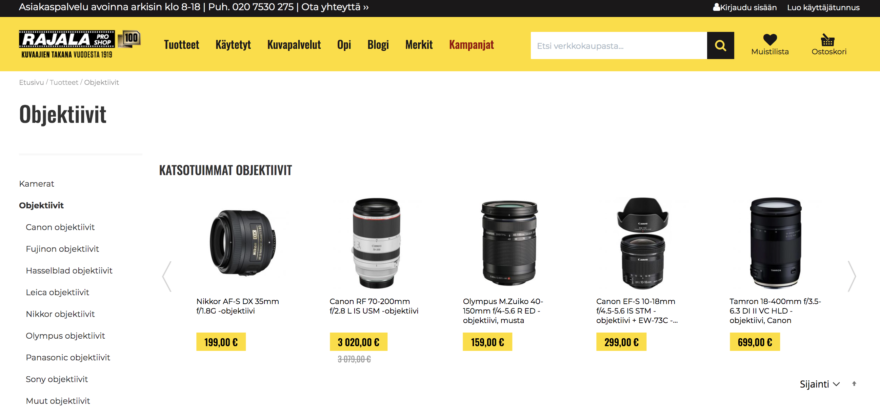
Rajala is also using customer data to experiment with the placing of the product filtering component.
Personalizing the product page
Before the customer actually makes a purchase, you can increase the average order value (AOV) by using effective product recommendations on the product pages. Personalization on product pages enables brands to reach out to customers in a way that directly and precisely meets their needs and desires.
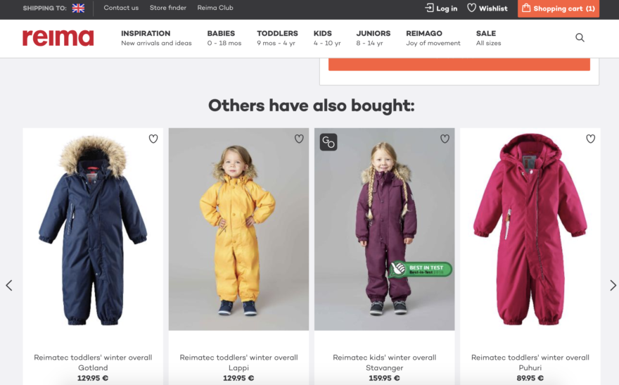
Reima, a global leading brand in functional kids’ wear, boosts sales by providing their customers with personalized product recommendations to find the most suitable items for each customer’s individual needs. Their strategy is to recommend products that other similar customers have bought.
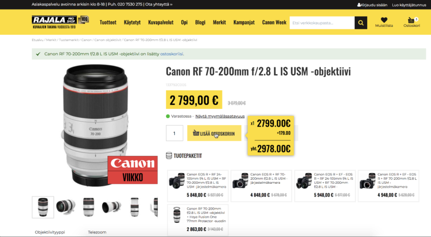
Rajala recently tested a feature by Frosmo where visitors can easily see the accessories associated with the product. In addition to being able to add suitable accessories directly to their cart, the visitors can also see the full price for the combination by hovering over the “Add to cart” option. This feature makes it easy for potential customers to make purchase decisions for the products they need.
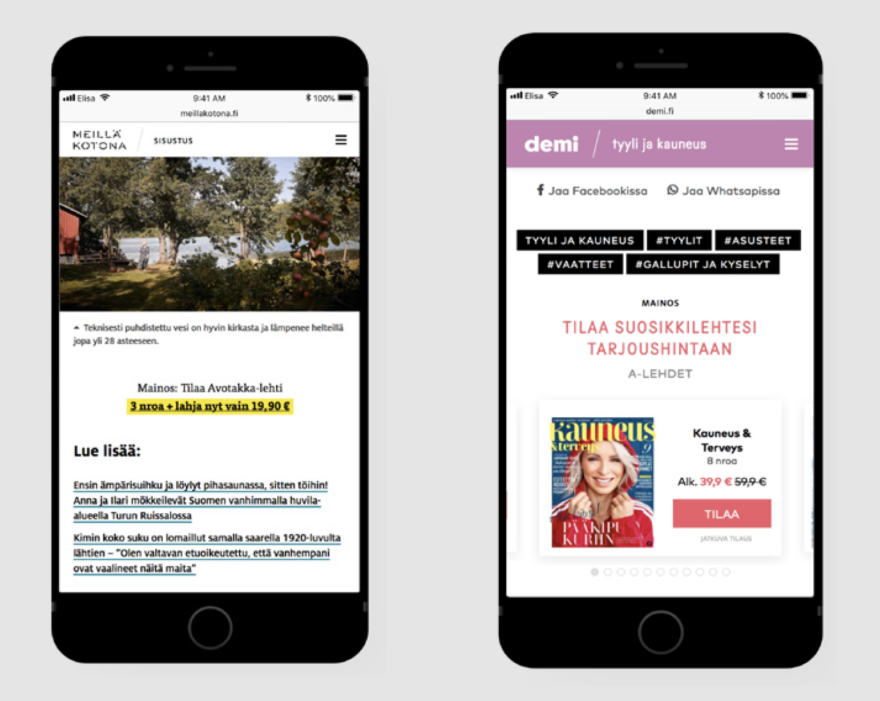
Accurate and relevant recommendations are key to providing meaningful visitor experiences. A-lehdet, a Finnish media house, shows personalized recommendations after the visitor has read an article.
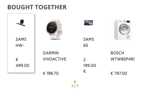
The product page is all about making sure the conversion happens and that the average order value increases. Traditionally, customers put a lot of effort to choose the product that best suits their needs. To make the choice easier, Power uses recommendation strategies based on relevant products viewed or bought by others as well as historical data of the visitor to recommend related products.
Personalizing the checkout page
A thank you page is not only good for showing the order information. It is also the perfect place to do upselling. Sweeten the deal by offering additional products that complement the item that your customer wants to buy. For example, for a dress, provide options for shoes and other accessories that match the dress. Personalized recommendations offer a more personalized shopping experience, leaving customers feeling more valued. Optimizing and personalizing your checkout page can bring amazing results.
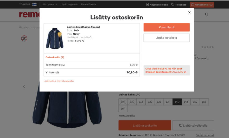
The delivery calculator has helped Reima boost sales at check-out by reminding customers how much more they need to buy to take advantage of free shipping.
Power is developing cart pop-ups for recommendations to include the data about store items in stock. It raises the level of relevancy and encourages effective cross-selling.
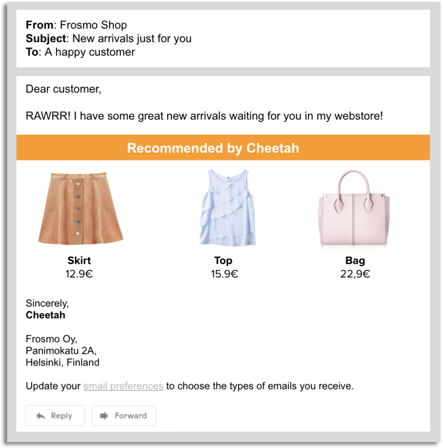
Of course, the customer journey shouldn’t end with a single purchase. With the customer’s consent, welcome them back later on with an email recommending complementary products for the products they already purchased.
Frosmo’s winning formula in website personalization
When trying to sell a product in a department store, you can’t have the same pitch to every potential customer. The same goes for online stores. A one-size-fits-all website doesn’t work if you want to get higher conversions and increase brand loyalty.
Frosmo’s winning formula in delivering the best personalization results in the market is based on a unique combination of the following key features:
We identify your visitors’ interests to understand every step on their customer journey. Our powerful personalization engine finds the winning product recommendation algorithm for each visitor on the right page at the exact right moment.
Smart customer journey orchestration is the key to delivering unique customer journeys that build loyalty, retention, and long-term benefits, both for the brands and the customers. And this is what Frosmo does- orchestrating customer journeys and helping brands take control of the entire customer experience through AI-driven personalization.
